
I’m part way through explaining why, in complex systems, the story is the measure. I first told a story to set the concept into context and introduced a metaphor to stimulate some thinking about what could be learned from it.
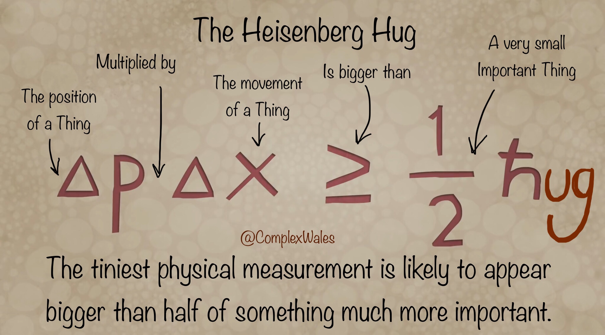
The Heisenberg Hug was my metaphor for the reality of measurement in most organisations. No matter how small: any physical numerical measurements will attract all the attention and quickly overwhelm far more important knowledge that is not so easy to represent. The equation says, if 2 numbers are at least half a hug, then it will only take 4 numbers to get no hugs at all. It’s a sad fact and despite how well intentioned people are, they’ll swoon for the number because it is easy to assimilate. Oh look, there’s a 4.9 and last time it was 4.8. Hooray, you don’t have to learn something about the real world, because it’s a simple undeniable fact that the world is now 0.1 more. That will do, next agenda item please.
On first impression, it’s a simple phrase and none of the words are tough to explain in common parlance. They are strung together in a slightly weird sentence, albeit that my usual intonation reinforces the sentiment: the story is the measure. Despite this, when I speak the phrase to people I am often confronted with a strange expression, like the stare you get from a dog, when they look you straight in the eye and then slowly tip their head to one side. I’m not sure if it’s perplexity or incredulity or trapped wind but whether or not you speak canine, over the next 10 minutes you are going to perfectly perform that look, at least once.
A while ago I explained when to use Story as a form of Representation, so now I’m going to begin to explain Measure. Everybody seems to immediately know what that word means, as it calls forth the image of a tape measure or a weighing scale and some discrete and relatively small numerical value.
The value is always small because people really struggle to relate to large numbers. For example, what does a million sugar cubes look like? Could you lift it and to get it home would you need a few carrier bags, or a car, or a van or even a dump truck? The answer is a bloody big van as the sugar cubes would fill a standard UK parking space to about knee deep and weigh the same as two family cars. However, to check the number of sugar cubes and count all 1000000, would take one person 7 weeks – assuming they worked full time, Monday to Friday from 9am to 5pm, with no breaks. Now that’s hard to get your head around.
In management parlance, measure is similarly used to refer to just about anything quantifiable. In the world of quality improvement, on the other hand, the proselytes have gone measurement potty and exalted data to the level of some kind of holy sacrament. “Data data data” they chant, sitting cross legged on a giant SPC Chart while placing a small picture of W Edwards Deming under their tongue. The Cultists typically begin their daily supplications with a bigoted prayer, “without data, you are just another person with” and at that point I usually shout out, “loads of experience and some deeply thought out critical insight”. That’s the long way to say ‘opinion’ and just to be clear, if you don’t have experience and insight, you don’t have an opinion, you are just another person with data.
Richard Feynman used to say that all good science starts with a guess. His baseline for a good guess, was a Degree in the subject you’re guessing about, so in reality, he probably meant an opinion. In that lecture he goes on to talk about how two very different hypotheses for the same phenomena, can both be proven to be right. He also emphasises how important it is in science, to hold many different competing hypotheses at the same time. It enables creative thinking and reveals new paths to better answers. This plurality is not something typically advocated in school or in work for that matter, especially when it comes to measurement.
There is an entire science of measurement called Metrology that is concerned with developing units of measurement, techniques to apply measurement to society and statutory standards for the practice of measurement. Almost all of it, is about engineering and precise physical measurements of inanimate objects. This is good, but it’s pretty much all on the left hand side of the Heisenberg Hug.
Unlearning ingrained ideas is really difficult but in terms of measurement, it’s also really important. Measurement is often defined as applying a number to a characteristic of an object or event and it is undoubtedly a powerful scientific tool for learning; when properly applied, for the right purpose and with the right motivation. But measurement is not just about numbers and it’s definitely not just about a wiggly line on a pretty chart.
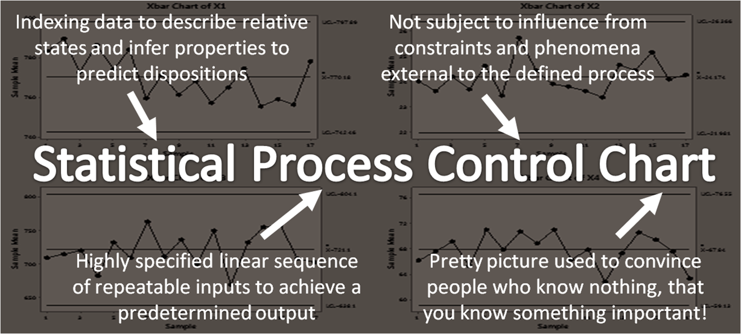
Unfortunately, wiggly lines on charts is quickly becoming the experience that most people have of measurement. Most of these charts that you come across in work (thanks to MS Excel) are little more than a standard picture of some numbers, displayed in such a way as to give the numbers more gravitas than they deserve.
If you want to impress a bunch of Leaderists, then text is not as convincing as a table, a table less convincing than a chart, a bunch of charts in a row makes a beloved Dashboard and a pretty Dashboard is now called an Infographic.
@complexwales
These colourful distractions are unparalleled in forcing a room full of otherwise intelligent people to sit quietly and stare at the Shiny. In a row of wonky dog nods, they are all desperately trying not to give away the fact, that they have absolutely no idea, what all the circles, arrows and boxes actually mean.
First rule of measurement club…
On a more serious note, the first rule of measurement club is to accurately name the thing being measured. This may sound daft but is it an Apple or an Orange? It’s that easy, don’t panic, just go out and properly count some important things. I’ve heard all sorts of people complaining about various performance measures with protestations along the lines of “this is like counting apples and oranges”.
Actually comparing apples and oranges is relatively easy: the apple shaped one is an Apple, the orange one is well, an Orange. There are only a couple of rare species of Apple and Orange that aren’t obvious just by looking at them, so most people don’t have to do much more than this. Never underestimate how much learning can be gained from simply identifying what’s important to you and counting things.
If you only got Apples, then you’re in the realm of the second rule of measurement club, choosing the right units. This means getting specific with not just size and colour, but also levels of tastiness, juiciness, skin timbre, sugar content, crunch, mastication texture and 11 other factors, typically used by professional Apple Tasters. That’s a real job! It’s much harder to compare Apples with other Apples, especially when some are good for eating, some baking and others brewing cider. So now you need different kinds of language along with some numbers to structure, differentiate and collate all the different sets of data.
There is an entire profession called Quantity Surveying, but they mostly work in the building industry. A big Apple with low juiciness, means you’ve got at least a size, a weight and a volume all in different units. What’s more, Apples come on trees so you got to think about which units are the most meaningful in practice. Apples may be good in Kilogrammes but Trees not so much, until they are being sold for lumber.
What’s more, the specificity that is really important for the Arborist, is not necessarily the same as for the Brewer. Having different datasets of detailed information is clearly important in many ways but can become all consuming, especially if you love Apples and go nerd-diving down to the fourth decimal place. Most organisations get stuck here busily deep-diving and over specifying things.
Then of course, all this specifying is pretty useful for piles of inanimate objects, but even the Apples will rot, so for anything with signs of life, a single measurement at a point in time, is next to useless. But before I move from counting Apples and specifying quantities, to the more difficult task of witnessing things in action, I need to put a shout out for professional specifiers, analysts and the various other splendid nerds employed to dive with datasets.
Data Mavens
And with that, we take a double back somersault down into the murky world of the Ginger Gareth. These data Mavens typically work in basements with no windows, have got more screens than friends, once had a girlfriend and still live with their mother.
You absolutely cannot run an IT department without them as they are the practitioners of contemporary witchcraft: down in the dark whispering code, hubblebubbling analysis and best of all, desquirreling data that nobody knew existed. Throughout my career I’ve worked with a number of fabulous Ginger Gareths. One notable Gareth (called Ricky) even invented a whole new field of analytics.
After several months of Executive Wonky Dog Nods and furious insistence that the data is simply not available, we sneaked into the basement and found Ricky. Within two minutes of starting to explain what we wanted, he said, “that’s a good idea, nobody has asked for that before” and zoned out back to his keyboard. A soupcon of coding witchcraft and he had desquirreled a massive server and emailed the answer over before we had even left the room.
This analytical technique (of sneaking around in basements) was named #TheRickyEffect. The sad truth of the matter is that in many organisations, Gareth and Ricky, end up spending way too much of their time tidying up wiggly lines, for some bloody idiot.
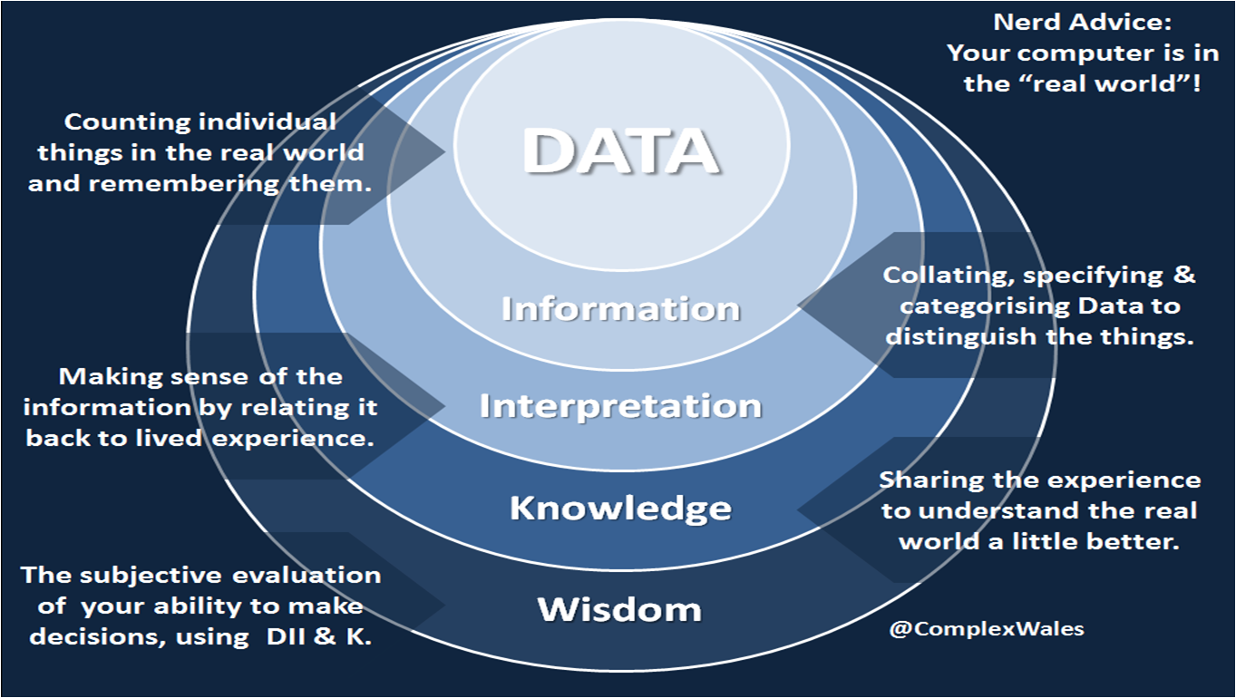
So I’ve just done the first two rules of measurement club and you can already see that despite the hype, data is only the starting point of measurement. I’ve tweeted out the adjacent graphic to try and reinforce that point as unfortunately in my business of healthcare, we’re perpetuating some pretty crappy old practices.
LOS…
A classic example is the ubiquitous reporting of Average Length of Stay, used to monitor how long patients stay in hospital and almost everybody buggers it up.
@complexwales
Calculating this measure typically involves extracting from the patient administration system, the date that the patient was discharged, the date the patient was admitted and their hospital number. You then subtract the two dates to get a number of days, add them all together and divide by the count of hospital numbers. It’s typically displayed to two decimal places on a virtually flat SPC chart, double averaged up to display a monthly dot going back for a couple of years, flanked by a couple of even flatter lines labeled control limits or standard deviation.
Now for a start subtracting two dates removes a day, whereas in reality the person was there on the first and last day, so everything is underestimated. Then two decimal places is the equivalent of 15 minutes. Nobody tracks length of stay by 15 minute intervals, so the number doesn’t really exist. Now some smartarses say they’ve got live bed states and that they calculate length of stay in hours even minutes, so it’s properly accurate. Russ Ackoff calls this, doing the wrong thing righter.
I usually ask, how many people are actually there for your ALOS and the answer is inevitably nobody. LOS is actually a Power Distribution, but they won’t change their beloved chart, so they get Gareth to hack it up into subspecialties, then only inpatients, then only electives, then only individual procedures and guess what, there’s still no average, not until you divide up the people so specifically that the cohorts don’t actually exist in any sufficient number to infer any statistical relevance. A long way to say cheating.
15 years ago I got involved in discharge planning. I did some pretty good data crunching and even some forensic level patient follows, mapping every event and interaction over days and even weeks in some instances. What we worked out was there were so many factors that affected someone’s journey through care that it was impossible to mathematically predict their LOS with any accuracy.
In fact we even used Data Maven Level serious maths and created an algorithm that could predict LOS quite well: as long as we removed almost all of the contingent factors from the model. In other words, made the algorithmic standard patient so simple that it represented less that 1 out of 10 of an actual caseload. Oh yes, and it turned out that even for those 1 in 10 the algorithm wasn’t quite as accurate, as the admitting nurse’s best guess. For all the other patients the algorithm was next to useless, if not dangerously oversimplified and so much less accurate than the nurse, who could quickly get a feel for the prescient factors. The peak of a power distribution is easy to predict, but all the complexity and therefore the work, was in the fat tail.
It took us a long time to figure out that even with an accurate prediction, there was a big glaring lack of understanding for the grit it takes to do the actual work – in a system set up to make the clinician almost as powerless as the patient. The feedback from clinical teams on knowing LOS was an almost universal, “so what?”
We ended up gathering all that feedback together with the experienced people who provided it and wrote some pretty good national guidance on how best to actively manage complex care in the fat tail. In truth LOS was never the issue. The issue was that nobody really understood how Flow in healthcare really works. Patients do not flow: work flows around them and it’s entirely dependent on balancing that distribution of patient Demand with an equally in-depth understanding of operational Capacity. Which by the way, is not a number of beds or bays or chairs or tests, but the amount of work a clinical team can undertake. It took me another 10 years to work out that equation, which is now written into statute!
In short, most of the ALOS idiots try to manage out the evils of variation. The trouble is, that for an otherwise fit patient with a broken leg, 2 days in hospital is fine, but they are sat next to a patient who broke their leg flying off a motorbike 20 years ago, and the 95 year old fella in the next bed, fell down the stairs. Go on, average that lot. Whether the person had a nice time in hospital, can walk again, could walk before, is worse or better off, or can now go bowling with his wife on the weekend, gets no airtime at all: compared to an ALOS, displayed as a wiggly line,on a chart.
And what do they use these wiggly lines for? Scowling at people who stay over the ALOS: “what, it’s an average?” Comparing two different wards with completely different patients and staff and environments: “What, that’s an Apple, that’s an Orange?” I could go on and I wish I had a pound for every time one of the Gareth’s has explained this to me, alongside their preference for a negative binomial distribution. As I slowly do the wonky dog nod, again.
Pedlars…
The Cultists have got to shoulder the blame for some of this, peddling their production line twonk where it doesn’t belong. They didn’t invent the ALOS or the bloody line chart, but they have spent the last few years doing the only thing they can, which is marketing their little Cult furiously. Like all Cults, there is only one Truth, all hail Deming, literally only one book and only one way to look at “data, data, data”. Frightened middle-managers everywhere are being indoctrinated, by a bunch of pedlars who – after a couple of days conditioning in a Cult Meeting and awarded a shiny certificate, or a coloured belt – are sent out to enforce Cult discipline on anyone frightened enough, to take it all at face value.
You may occasionally find a Cultist who understands deep stuff like the Calculus of Variations, but the slightest challenge to the lack of scientific pluralism and you usually get squeals of “it’s because they don’t apply it properly” criticising everyone as they point to a dot, on a fake wiggly line and shout “special cause variation”. Push them too hard and like Pavlov’s dog, they drop to their knees and start chanting “system of profound knowledge”. Which by the way has no systemic characteristics, contains little intellectual depth and is neither referenced, nor cited epistemologically. ‘Of’ is the only true word and I even argued with that recently, during a bloggy foray into the Japanese Union of Scientists and Engineers. The typical result of the idea is some arsehole mouthing off about ‘The System of DISPLAYING A Profound LACK OF Knowledge’.
The four things in SOPK were actually a suggestion by Walter Shewhart for some research that never went anywhere. Yes I know it’s touted as Deming’s curriculum and theory of management but in reality it was just a book: cobbled together amongst an explosion of other management guru books, to nail some IP for Deming before he died. I’ve got nothing against Deming by all accounts a lovely bloke. It’s the tyrannical peddling by disciples who don’t understand the ideas, let alone their origin, that winds me up.
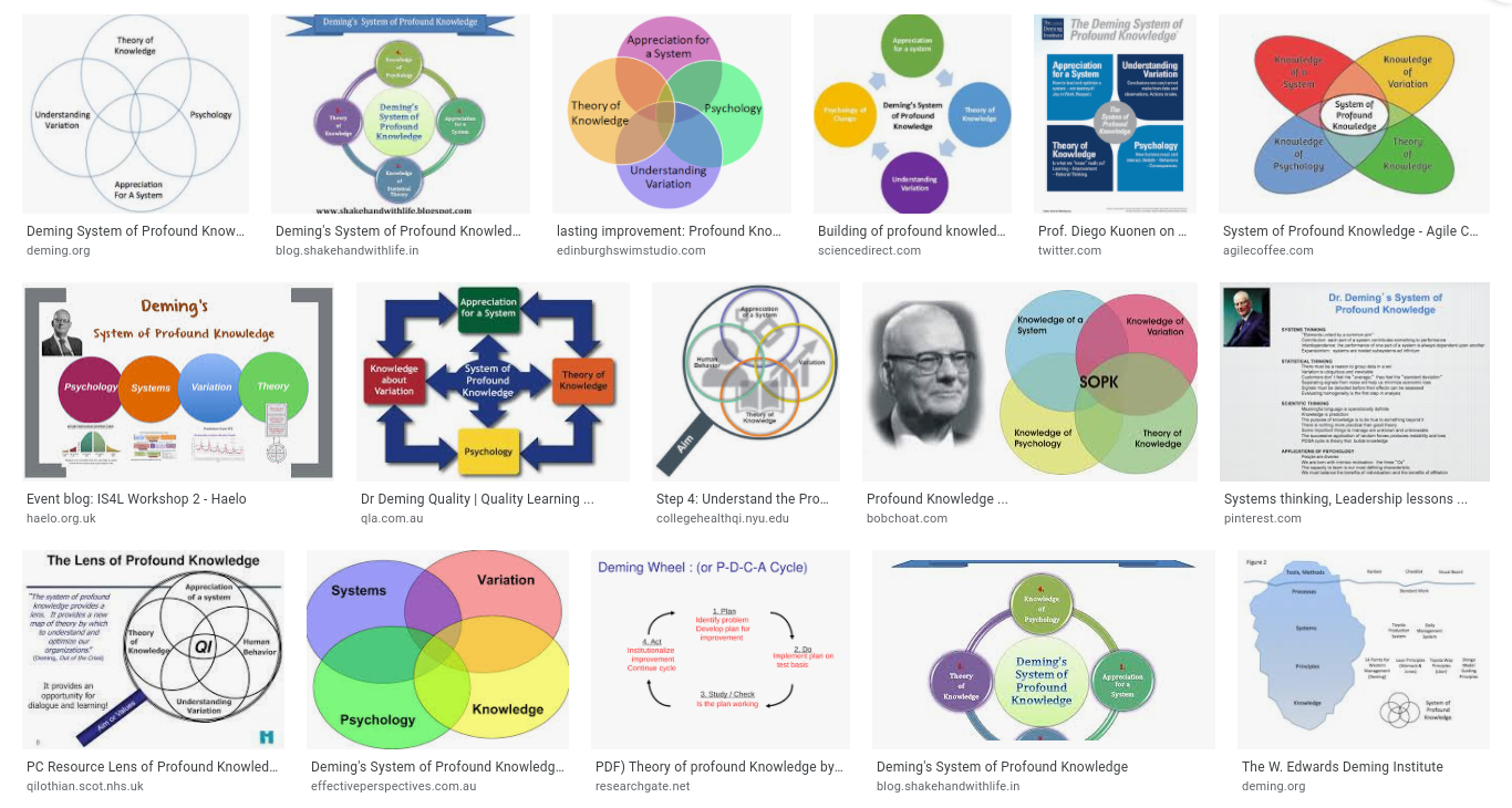
Typically arranged in any random shape, the four words are displayed on a big screen behind some Charlatan usually paid to market the IHI – in healthcare the self appointed high priests of the Cult. You can have fun with these fakers when the slide inevitably pops, by asking how each word relates to the other. A few flakey words of bullshit about Systems, Psychology and Epistemology before they bang on about the evils of Variation, hence shouldering some of the blame. Start asking questions about the other three and they usually just panic and move on.
Third rule of measurement club…
In living systems like those involving normal humans, there is no such thing as an average from which to vary. There are differences between people, so many in fact that there is no such thing as an average person. Nobody is average and speaking philosophically, nobody varies in degrees from perfect because we are not widgets on a production line and there is no perfect design from which to assess the mathematical variation of a human.
There is certainly nothing to be learned from chunking things up into weekly, monthly and annual averages. The evidence is unequivocal that anything designed for the average person is in fact, designed for nobody at all. I shall explain that with a little help from @ltoddrose in the next episode of #TSisTM.
In the meantime, for God’s sake, set your Ginger Gareths free to do some proper analysis using all their specificity witchcraft and a whole bucket of hypotheses. Or even better get yourself off to see the splendid Mr Barton and remind yourself of all the lovely maths you never thought you’d ever use.
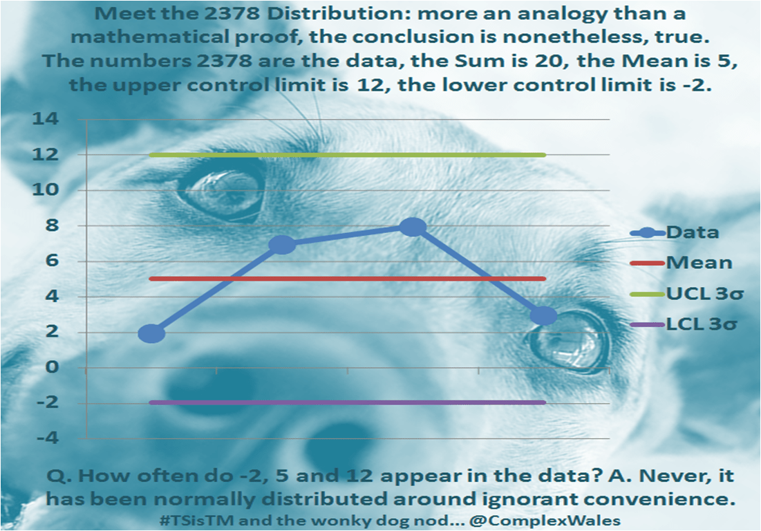
Then the next time some Cultist whips out a bloody SPC Chart, give them the Wonky Dog Nod and ask them how many times the average appears in the dataset. If the answer is anything other than never, they are probably cheating, by chunking things up into averages of averages or over-specifying down into distributions of one or less.
I was taught about those distributions by an half sober, cantankerous old mathematics professor, with the numbers 2378 tattooed on his knuckles…

