

The Picture
Watch this space for installations on what is: An Allegory of Prudence, Titian c.1566.
The image presented above is a digital reproduction of a painting by the Italian Renaissance artist Tiziano Vecellio, more commonly known as Titian. The original painting is entitled An Allegory of Prudence and is one of 17 works by the artist, housed in the collection at The National Gallery in London. The image is available for download under creative commons, from their website for a small donation.
This painting has been chosen to symbolize the fifth and final form of Representation in this series of blogs, namely Art, as it has been subjected over the years, to a large number of interpretations.
Questions have been raised over whether the picture represents Titian himself and his assistants; whether it represents the passage of time and wisdom; whether it reflects Titian’s own penitence toward the end of his life; whether it is an artwork in its own right or the dust cover for another; and even whether it’s attribution to Titian is correct, given the variety of styles and techniques visible. Before reading on, take a few minutes to really look at the big picture and soak it in.
The Diagram
Watch this space for installations on its specification:
The painting is an ‘oil on canvas’ and its dimensions excluding the frame, are 76.2 cm by 68.6 cm. Inventory number NG6376, the painting is on permanent display in Room 6 at the National Gallery in London.

Reflecting the Mannerism of the Late Renaissance, the painting is highly structured and symbolic, depicting the portraits of three men, appearing old, middle aged and young. The portraits show just the heads of the men, arranged back to back the centre figure facing forwards and that to the left and right, in profile. The heads are aligned above three similarly oriented animal portraits of a Wolf, a Lion and a Dog. The six heads are all placed within a dark, undifferentiated background upon which a number of barely visible words are inscribed. The words are three phrases in Latin that have been translated as:
- EX PRAETERITO – from the experience of the past
- PRAESENS PRUDENTER AGIT – the present acts prudently
- NE FUTURA ACTIONẼ DETURPET – lest it spoil future action
The painting has undergone a detailed assessment including radiography of the structure and underlying layers of imagery, together with an expert analysis of the pigments and their application at a microscopic level. A detailed description of this provenance testing can be found from page 15 of this technical bulletin published by the National Gallery.
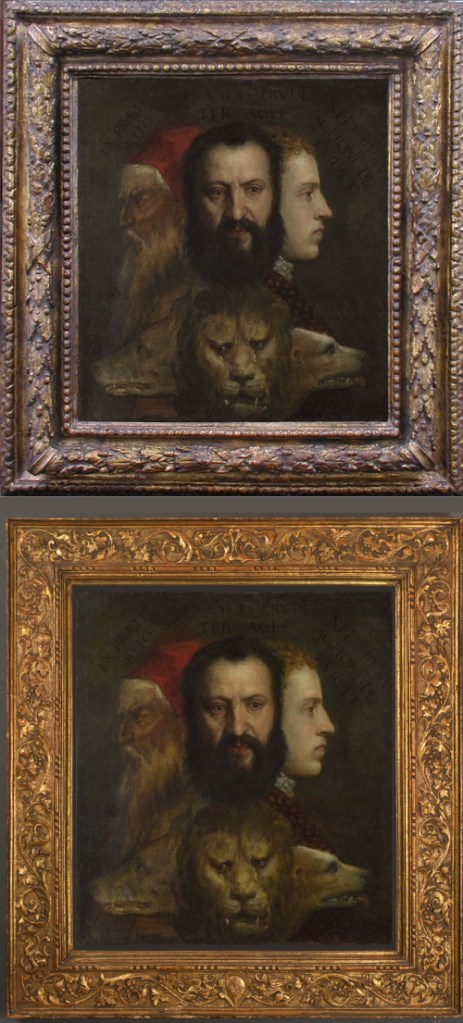
Titian: An allegory of prudence, c.1550-65, before (top) & after.
When received into the National Gallery collection, the painting was contained in a 17th Century French Louis XIII Frame. A crowdfunding appeal was launched in 2014 to purchase a 16th century Venetian cassetta for the painting. The appeal was successful, and the ‘new’ frame illuminated the painting, both in terms of chronological and structural sympathy, and of ornament appropriate to the painting, as illustrated in the adjacent image.
The translation of the Latin phrases gave the painting its title and inspired the numerous attempts to interpret what deeper meaning, if any, that the artist was attempting to convey. It was not uncommon for Artists particularly amid the Renaissance to embed societal, political and even heretical messages and meanings within their works of Art. As such – and as is perfectly exemplified within this painting – the intention was often to subtly encourage or even deliberately trigger these sorts of interpretations.
As you can see from the yellow schematic at the start of this section, Diagrams are lousy ways to represent Art, loosing in the simplification pretty much everything that makes it Art. So it’s a little ironic in this section of the blog that the intentionality described is a good articulation of when a thing or idea is best represented in Art: when, in the absence of a single correct truth, it is the principle intention of the Representation to stimulate multiple interpretations, meanings and messages together with physical, social, emotional, mental and moral reactions within and beyond the immediate audience.
The Story
Watch this space for installations on its journey:
I suppose I’d better start with a potted history of the painting. Various experts have estimated that the painting was produced around 1566, or 10 years before Titian died, mostly on account of the ‘ultima manire’ or late style of the techniques in parts of the painting. However, the piece was not mentioned in any writings or inventories of Titian’s work until 1740, when the painting was recorded in the Crozat Sale in France. The second occasion was again in France at the Duc de Tallard Sale in 1756, although at that time, the faces were identified as Alfonzo de Este, Pope Julius II and Emperor Charles V.
Over the following 200 years the painting moved through many collections, ending up at the Francis Howard Sale at Christie’s on 26 November 1956. On this occasion, it was described with a new identification of the faces by Erwin Panofsky, as a self-portrait by Titian with two assistants, his son Orazio and cousin Marco Vecellio. Despite the relative implausibility of this description, the picture was bought by a respected fine-art dealer David Koetser and subsequently donated to the National Gallery of London.
I first came across this picture a few years ago while attempting to improve the MoG rating of an idea of mine. A MoG is the research unit of measurement, for the quality of an idea: 5MoG is pathetic, 1000MoG and it’s got some substance. Minutes on Google!
At the time, I was working for a national programme within the NHS, looking to improve the quality and safety (but mostly the cost) of Continuing Healthcare. It was a complicated area of work, attempting to align new statutory requirements, with specialist clinical practice, across 8 organisations hampered with an extraordinarily badly conceived and designed, pyramidal bureaucracy.
Facilitating an eclectic and diverse network of professions and organisations, we reached the tumultuous conclusion that: if only we got a little better at supporting people with complex needs to live a fulfilling life, there would be less demand for very expensive packages of Continuing Healthcare.
Spend a little more now to save a great deal later, became our mantra, but we struggled to find a way of explaining that to the Leadership atop the pyramids. I was looking for a way of representing the idea and ended up with some very interesting Boolean Strings from a thesaurus search widget. Google kept spiraling around the word Prudent and up popped the picture. Having at least a passing interest in the Philosophy of Art and Architecture, my brain saw the Prudent story, or allegory in the painting. My insight came from what Gladwell refers to as a thin slice; or a glimpse of something that seemed to fit my view of the world.
The idea that the faces are oriented around time, fitted my own schema, with from left to right, age coming from the past, at your prime in the present, and youth looking towards the future. For me the animals even made sense, with the wily old wolf, the lion’s strength and the playful dog. In Art these animals are occasionally also used to represent the worst of the three ages of man; the greedy wolf, prideful lion, and lustful dog.
I then read around the painting, found the Latin interpretation and thought it was absolutely perfect. A way of explaining a complex concept; that to look after the older population (morally obligated) we must make important decisions now (intellectually prudent) to make the system affordable for future generations (socially sustainable). What a winner I thought and started talking to people about the metaphor and the principles of working now, in a way that secures the future. I lost everyone in the metaphors.
A couple of years later, we ended up with a national initiative called Prudent Healthcare, so I’d like to think that the idea triggered something useful in at least a few minds. Unfortunately, those who championed the initiative didn’t understand the underlying behavioural economics and invented principles that were similarly interpreted and reinterpreted until they were used to mean both anything everywhere, and nothing at all.

I tried to explain this trap at the time, as I’d learnt an important lesson, having already invested time and effort in the wrong way to represent a worthy idea. But, as with any Threshold Concept they had to learn it for themselves and looking back, taking just the three time oriented perspectives in the painting, may have been enough to better align some meaningful action.
The painting in its entirety as An Allegory of Prudence and whether it is a work by Titian or not, is open to way too much interpretation. What this means is the ability to interpret and reinterpret the painting or any other artistic Representation, makes it a wonderful tool for encouraging reflection and exploring meaning around a subject, even that of the dull mire of bureaucracy surrounding Continuing Healthcare.
The wonderful symbolism in the painting made it a lousy device to help people understand and agree what to do next and in which order. That needed a different form of Representation that was less abstract.
The Metaphor
Watch this space for installations on its meaning:
The painting is believed to work on a number of different symbolic and intellectual levels. There’s a perfect article to explain this phenomena by Phillip McCouat in the Journal of Art in Society.
As usual when exploring a subject and reading articles like that one above, I enjoy talking to the wonderfully eclectic bunch of people that I often share a glass of wine with. Whilst attempting to dig down to what these blogs on Representation are all about, a lovely nugget emerged and I have permission to share it, albeit anonymously:
“I don’t understand this” she said, to which I simply replied, “that’s the point. You’re not meant to from the beginning. I’m writing the Art post, as though it were an art installation in itself, a bit at a time”. I then owned up to it being my rather clumsy attempt at inferring the meta sense of representing Representation, in a form that immerses people in learning it from themselves, rather than from me. After quite a long quiet pause, of which I love the awkwardness, she asked, “so where would you place that ‘meta sense’ your own structure, when you’ve already established the landscape, as just a painting”? I looked her straight in the eye, trying not to give away the answer and before any words could form, she gave a self-congratulatory smile and with a slightly dissonant shake of the head, said “it goes in the story you’re telling about the painting, it does not necessarily have to be the story of, the painting”. Then with the gentlest and most subtle of tells, she sat up, topped up both glasses and said clearly, but mostly to herself; “shit, it’s a meta…phor!”
Pinot Noir 2018.
So this Blog itself, is a Metaphor for Representation. Just like the little cardboard landscape described in the previous posts, the painting is not a Metaphor. Whereas painting of itself can be a Metaphor (like this clumsy blog), the artwork in this instance An Allegory of Prudence, is not even a metaphor for prudence, or more accurately, is not just a metaphor. The painting is the stimulant for the metaphors held in the minds of the audience and a powerful one that has spanned the very different social, political and philosophical minds across nearly 400 years. So Art is not simply another Turtle, it’s much more than that.
That’s the thing about Metaphors, you can derive them from Stories, if you know how to look for them. Can Art whether it’s a painting actually called prudence or not, ever be a suitable Metaphor for a concept such as prudence. Or, is Art always going to be open to the subjectivity that fills the space between the expression of the Artist and the experience of the Audience?
The Art
Watch this space for installations on R100%:
To answer that question, the clue is in the subtitle. Google ‘Art’ and you get: the expression or application of human creative skill and imagination, typically in a visual form such as painting or sculpture, producing works to be appreciated primarily for their beauty or emotional power.
The word is also used as a collective noun for the various disciplines of music, literature, dance, sculpture and painting, but perhaps more interestingly it’s used more like a verb or even an adjective, as in “the art of conversation” or “the state of the art” meaning the best of any particular field.
In a whole variety of professions, sports, activities and even lifestyles the craftsmen, elite performers or gurus are often referred to as Artists. It infers that there is somehow a beauty in not just what they do, but how they do it. And believe me, you’ll find that expression used with considerable passion in some very nerdy, boring and stagnant corners of the world that I certainly wouldn’t associate with Art!
Aesthetics is an entire area of study and practice in its own right. What makes something appealing to look at? Can something be beautiful without being able to see it? Or is that just it, Art is a subjective experience. At this point I have to acknowledge the cringing pomposity that certain Art-Loveys can quickly descend into. There’s a distasteful slimy elitism around some of the Arts, that’s more to do with having way too much spare time and money, than really appreciating the Art and the Artist.
However, the importance of beauty to people is poorly understood and the subject of a great deal of professional and popular debate, whether that’s in terms of objective analysis or subjective experience or expert opinion or utterly uninformed instinctive oohs and aahs! I think that beauty is as powerful as it is delicate and here’s a good way to spend 7 minutes of your life thinking about it:
Why beautiful things make us happy, is not a question to end on. But with all good Art, one of the the Arts, is knowing when to stop. And on that note, when it comes to being good at Representation, the best practice wherever possible is to stop. Don’t do it! If you can bring the Thing into the room, do so and if you can’t, take the people to the Thing. Representation is never as good as people experiencing the thing together, in real life.
Writing this blog has sent me off musing over the necessity in all human endeavors to always focus some attention on creating delight. The psychology of delight is fascinating and I tend to talk about it with a fair dollop of Maslow and a running kick in nuts of positive psychology. But that is a whole series of new posts just there. In short, no matter what you’re doing, or whatever Representations you’re attempting, always try your best to be authentic and offer at least, a couple of moments of delight for other people to take away. So here’s my moment to take away. Congratulate yourself on where you’ve been across 5 long posts on Representation, summed up in 5 short bullets.
Delight & R100%
- If the Thing really can’t be present and you have to represent it, just use plenty of high definition Pictures, with a few words of fact and keep subjective opinions to a minimum. R20% = Form
- When trying to explain how a Thing works, use a Diagram to simplify it down into its most important discrete parts, with just enough detail to clearly define the parts and how they are connected. R40% = Mechanism
- If the context is more important than the attributes of the Thing itself, tell a Story of the Thing, situated in time and place and rooted in your own authentic experience, so people feel safe to retell your story. R60% = Interaction
- When the Thing is just out of reach, at the edge of people’s comprehension, use a Metaphor to help them imagine how it may behave under changing conditions and in different situations, to expand understanding and inform decisions that are oriented towards an uncertain future. R80% = Function
- Great Art contains Metaphors, Stories, Diagrams and Pictures. This is why in the absence of a single truth about a Thing, Art is the best form of Representation to stimulate all sorts of obscure connections and spontaneous reactions. The best reaction of all, whether light and beautiful, dark and funny, or deep and meaningful; is the one that you get from a Thing that stimulates a memorable and personal aesthetic experience that is simply filled, with delight. R100% = Purpose
