I’ve completely rewritten this follow up to the first blog on Representation, four times already. Each attempt, despite my different initial approaches, has ended up in a petulant performance by Captain Rantypants. Here I go again, trying to stay objective and polite. Breathe and relax … Diagrams.
There are a whole world of different things referred to as ‘diagrams‘, or some subset thereof, such as charts, plans and schematics. There are also graphs, but most of them are just pictures of data and I covered that off last time.
In it’s most basic sense a diagram is a way of representing a thing by breaking it down into its parts. Or at least some of its parts, the most pertinent or significant parts, chosen mostly for their ability to convey what something is, without necessarily all the detail of the thing itself: R40%. Diagrams are simplifications that explain the relationships of the parts, what is connected to what, and what those parts do, the mechanisms.
Don’t confuse ‘what the parts do’ with ‘what the thing is for’, mechanism (the former) is not the same as function (the latter). What a teaspoon does; is to catch some tea in a scoop that’s small enough to fit in a tea cup, to swirl the liquid about and mix the infusion with the milk. The scoop is on a short handle which protects the power source from being dunked in the scolding liquid. Taking the teaspoon to wedge open a door means it’s now a wedge. The mechanisms and parts of a tea spoon may not be the most effective, but wedge is now the function you have assigned to it.
This is the biggest problem is that the author mixes up what the thing being represented is for, with the required description of how it works. Diagrams are typically written or drawn, and include words and pictures in combination. The combination or sequence is the essence of what a diagram is for, to convey the relationships between the significant parts in the designed order. Design is an important word when it comes to the use of diagrams as they are most useful when they are – there’s no getting around it – useful, pragmatic, tangible, practically oriented. Diagrams do mechanism!
However, don’t make the mistake of thinking that diagrams are restricted to shapes drawn on paper – you know the typical management befuddle of words drawn in boxes connected with lines so beautifully illustrated. Look closely, it’s in fact, a Diagram of this blog.
An Airfix kit of a jumbo jet or a child’s toy aeroplane, is in representative terms, an equivalent diagram. The common phrase used for these three dimensional simplifications is Scale Model, but let’s not confuse things with the common usage of that bloody M word again.
Ontologically an annotated drawing of the shapes of the parts of a jumbo jet on a sheet of paper, isn’t that different from a collection of little bits on a sheet of plastic in the shapes of parts of a jumbo jet. Gluing 100 little bits of plastic together into the shape of the plane, does not create a jumbo jet. It creates a little simplification of the 6,000,000 parts that actually make a real jumbo jet. A three dimensional simplification.
This may sound slightly mad but three dimensional diagrams are fairly normal. An architect designing a huge new building, typically sketches out the ideas on paper, and then increases the specificity of the design by reproducing those sketches as scaled plans and elevations on a Computer Aided Design package. These CAD systems are also used to create amazing three dimensional images of the building with wizzy animations. However, nothing works better to help most people understand the design, than a little toy version of the building made of balsa wood, cardboard and sticky back plastic. Explaining the representation you form in your head while trying to imagine how this little toy building may function in the real world, is still two blog posts away!
So laying out something complicated as a disassembled set of parts with an explanation of what is connected to what in which order, is bloody useful. A really complicated thing may need a couple of separate diagrams and this gives you a sense of what sorts of things are best represented by diagrams: things made up of discrete parts. Explaining how the jumbo jet works with an electrical wiring diagram, an engine specification, some little plastic seats in rows and an isometric elevation of a fuel injection assembly, will usually suffice. Diagrams are mostly used legitimately by people who have a great deal of technical knowledge, to explain and convey critical information or increase the prescience of critical paths in a sequence of mechanisms.
What it’s like to own that jumbo jet for 10 years on the other hand, requires something else, additional insight that cannot be adequately conveyed in a diagram. Similarly, helping a stranger understand your grandmother is not best achieved by a sequence of anatomical diagrams. Think about it, you’d use a different form of representation to explain grandma.
Diagrams do take a little expertise to interpret. An electrician can read a wiring diagram as easily as you or me can read this sentence. Probably faster and easier, because diagrams use queues and symbols and shortcuts to increase their visual perspicacity. Nicely designed to convey complicated information quickly. Process maps of a particular flow of work are similarly, instantly recognizable to those who do the flow of work. But with a little instruction anyone can work it out.
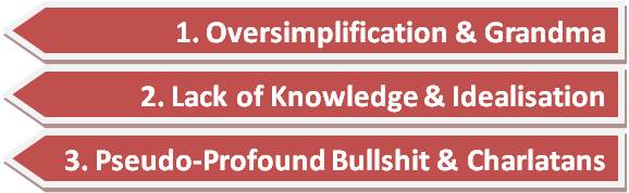
The Three Reasons for Shit Diagrams
This is the key to diagrams as when you can’t work it out, there are usually three types of mistake to look out for:
Oversimplification: the thing being explained is complex not mechanistic and therefore cannot be simplified into a diagram without loosing the essence of what makes it complex – the attributes, behaviours and emergent properties not present in the parts. (grandma)
Lack of Knowledge: the diagram is chunked up, lacking a sufficiently granular description, often designed by somebody who with the best of intentions, doesn’t sufficiently understand the thing being explained and inevitably mixes up mechanism with confident platitudes about desired function. A classic example of the Dunning-Kruger Effect. (idealisation)
Pseudo-profound bullshit: someone has produced a half arsed idea and is desperately trying to give it credibility by drawing the words out using a form of representation synonymous with technical insight, when there is none. (charlatans)
So if you can’t understand what the thing is from a diagram, either the thing is more suited to another form of representation, or more likely, the person presenting the diagram is full of shit!
Lastly diagrams are really useful forms of representation, but please pay close attention to mistake number 3. Every single Leadership Paradigm, almost every Management Model and the vast majority of all Driver Diagrams ever produced, fall into this category.


Hi, enjoyed the read. Started blogg on theaudiblepatientvoice this week. Interested in shared decision making and safety.
LikeLike